
It’s that time, time to finally create a a website. I knew the hosting process for static websites wouldn’t be too complicated since there’s no databases involved. On Tuesday the 7th of May 2024 I began the development of my own website, the intention of this website was to showcase projects I’ve made, things I’ve done, learnt, and like. I also wanted to improve my typing skills; to get the opinion of what other people think of the quality of my typing. I like to type things in a fun, exciting way where it’s not too complicated or loses the reader’s attention.
Day 1: Creating the project files
I created a index.html for the layout of my website, the index.js file for the functionality, and finally the index.css file for the styling. I originally was going to use Hugo (framework for building websites), but didn’t quite understand how to customize the templates to my liking, so here we are, I just created my own from scratch. First thing I wanted to create the the function of dynamically loading posts from a JSON file, this wasn’t too complicated, I created a simple JSON file that looks like this:
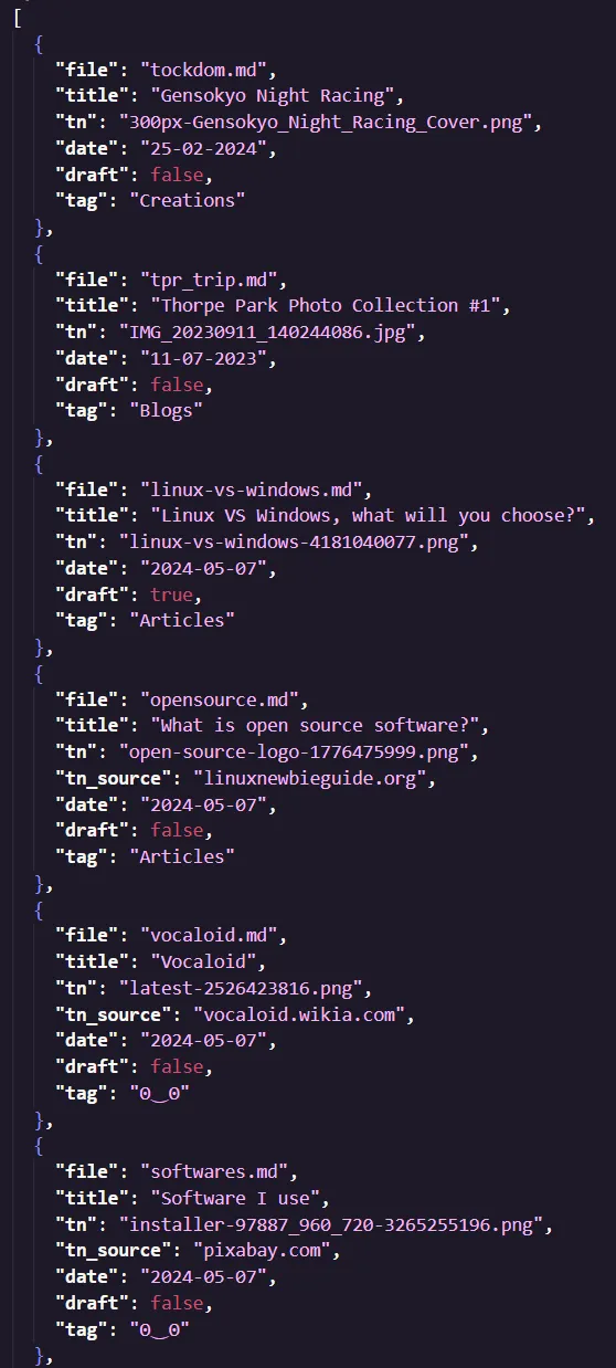
Simply put, it holds all the metadata for the posts. The idea is when the user clicks a post it loads the associated markdown file. Firstly, I needed a way to read content from a Markdown file and to present it within a HTML Element, and for that I used showdown. It’s an extremely reliable MD to HTML parser.
Day 2: Image Optimization
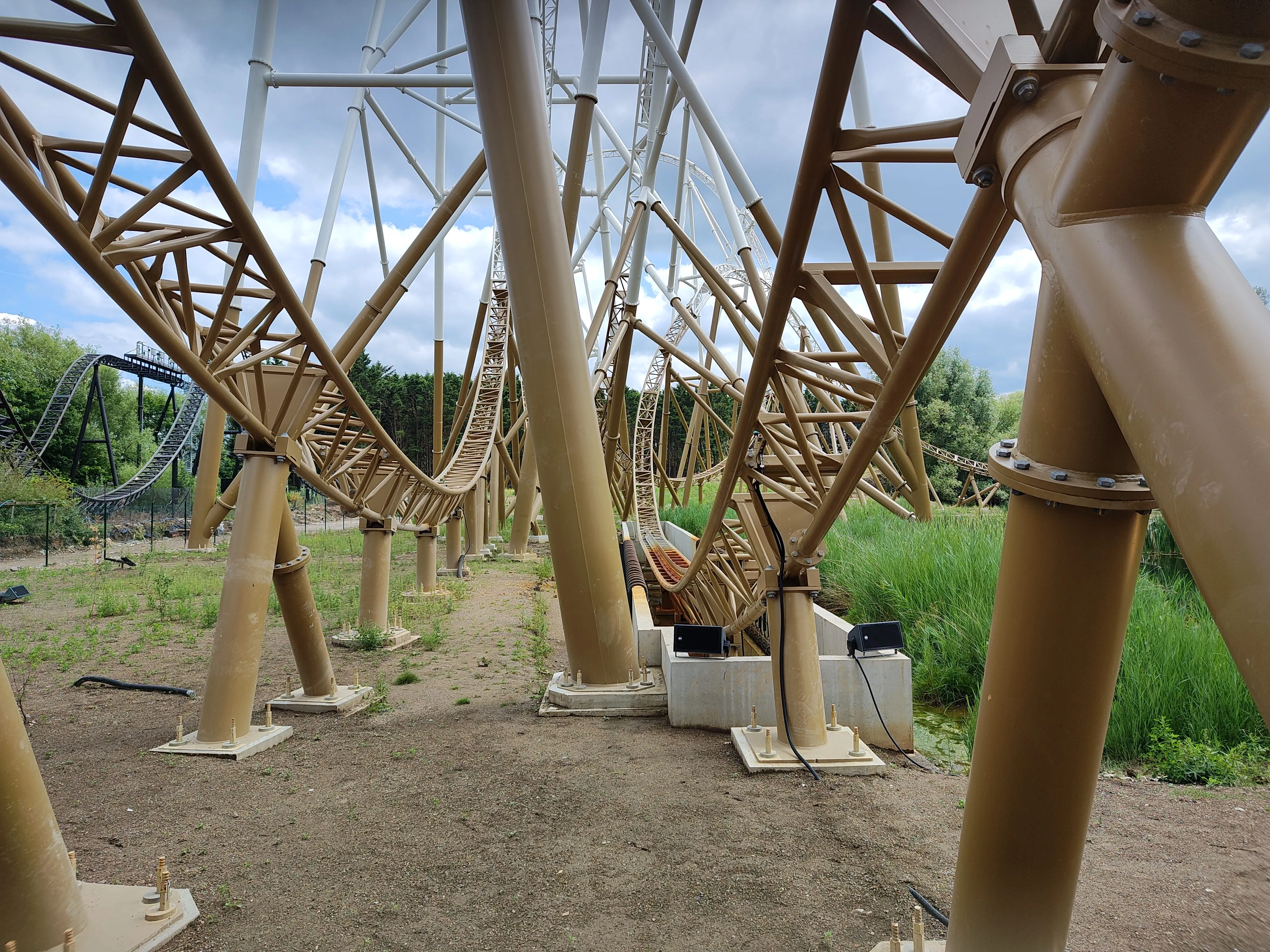
20 megabyte transfers… no just no, this was too much! I created a Python script to optimize all images within my project files. The way this would work would be for each iteration of the loop to downscale the image by dividing itself by 2 and keep going until the file size was 2 megabytes or less. Would you look at that, the size of my image collection went from 144 megabytes to 55! This also meant that every time an image had to load from the server to be displayed on the website, it would take very little bandwidth, effectively preserving data charges.
Day 3: Mobile Optimization
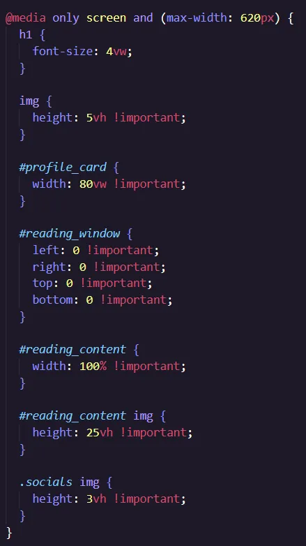
Yeah… I only intended the website to be used on computers, therefore mobile support was close to non-existent. I created this chunk of CSS that changed the appropriate values so they were more suitable for smaller screens.
As you can see, if the max-width is less than 620px the following CSS is applied:
This was pretty much all I needed to do, easier then I thought actually.
One other thing I wanted to do was to add relative time for the posts, this subtracts the current time from the date the article was published. To avoid any complicated math, I used a JavaScript module (Day.js) to calculate the time difference.
Day 4: The website was complete!
There wasn’t much else to do apart from continuously testing everything to ensure it was working as intended. Hope you enjoyed this miniature development log! here we go again
Of course it wasn’t over yet, after my family testing the website it apparently didn’t work on any chromium based browsers. This was because of an element that supposedly wasn’t defined, even though it was and worked perfectly gecko browsers while testing. Anyways I removed the element since I wasn’t using it anyways (maybe that’s why Chromium complained).
Finally, all done!
I’m very happy with this website, everything works as of now, I don’t plan to add anything complicated to the website in terms of functionality, this is so I can keep the code as low-level and minimal as possible.